
| Subject: | Re: List Stickers Opinion |
| From: | Bill Davidson |
| Date: | Mon, 14 Aug 2000 11:22:17 -0700 |
> 1. White sticker on my wife's BLACK Cherokee with tinted windows: VERY
> VISIBLE!

Perfect example of contrast (white on black)... part of what I was saying..

> 2. Blue sticker on back window of my white Westy:  NOT VISIBLE (very
subtle)

Only because the background of the sticker is clear... no contrast with the
stuff inside the vanagon which creates visual distraction rather than
contrast... the other part of what I was saying...

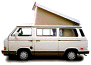
> 3. Blue sticker on back of white pop top (next to Westfalia logo): VERY
> VISIBLE

Further illustrates my comment in #2 above.... a clear sticker background
only works if what behind it is a solid, contrasting color...

> 4. Yellow sticker on back window of white westy: VISIBLE, but ugly, IMHO
>

Again... due to clear sticker, only REALLY visible if what is behind the
sticker is a contrasting color and does not visually distract... this will
not be the case for all...

> If you want VISIBILITY - go with a white or yellow sticker on your back
> window.

Will NOT be visible unless the stuff on the inside of the van is contrasting
color.... for instance... a white sticker with the gray Westy curtains
behind it will NOT contrast and NOT be visible....

Or, if you have a white pop-top, use a blue sticker on the front
> and rear of the pop-top next to the Westfalia logo.

Agreed... but who wants to risk damagin the surface of the pop top if you
ever remove the sticker?

> As the French say: "Chacon a son gout"  (Each to his own taste)
>

Sure... if people are happy with the visibility of the sticker that okay by
me... I want to point out that I don't think they are very visibile and ways
to make that better... like for window situations backing the sticker with a
contrasting color paper... or, maybe with future printings of the sticker
having a solid, contrasting background sticker color...

Bill
Have something to add on this topic today? Revive this thread in the forum »